


photo: gadi dagon


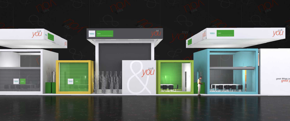
booth design for CPHI madrid 2012, implemented by decoexpo s.l.


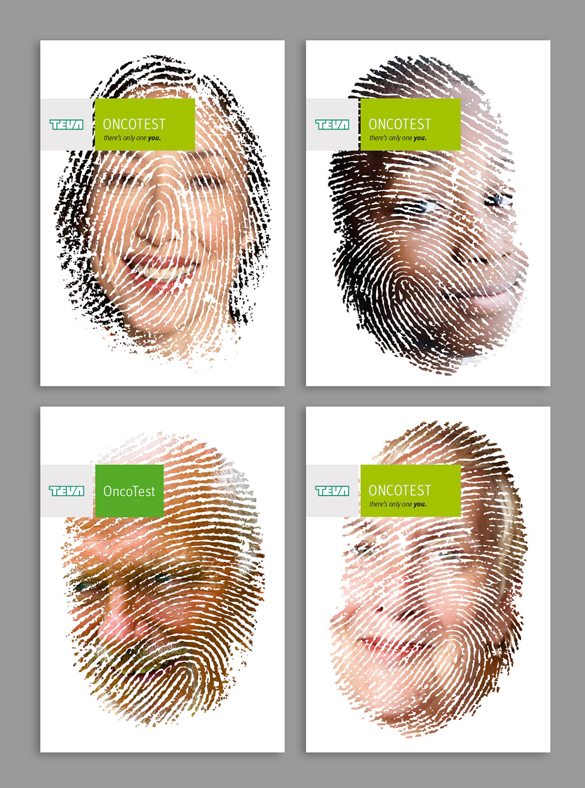

copy reads: when people say "thank you, teva", they mean you.
( internal campaign for factory workers )
( internal campaign for factory workers )


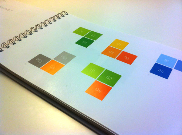
following are pages from the corporate language styleguide
