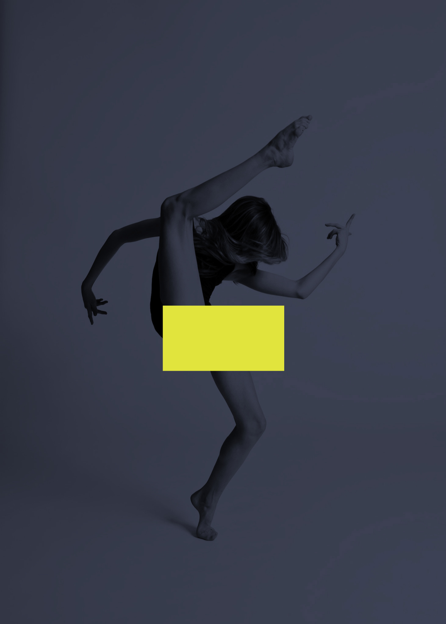
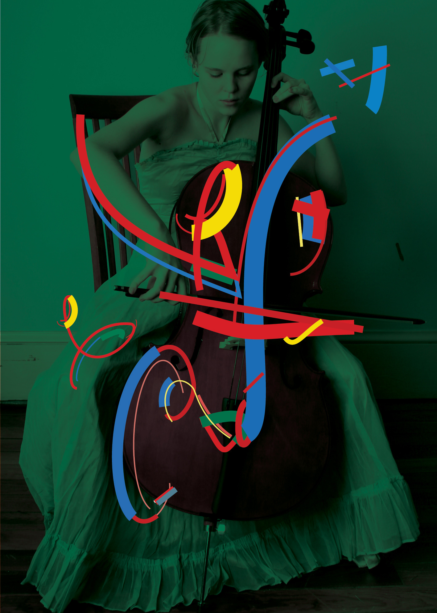
started by using a distinct logo element reused to censor/highlight the image underneath. a small bit of criticism in these times of blatant censorship of culture and thoughts in my country
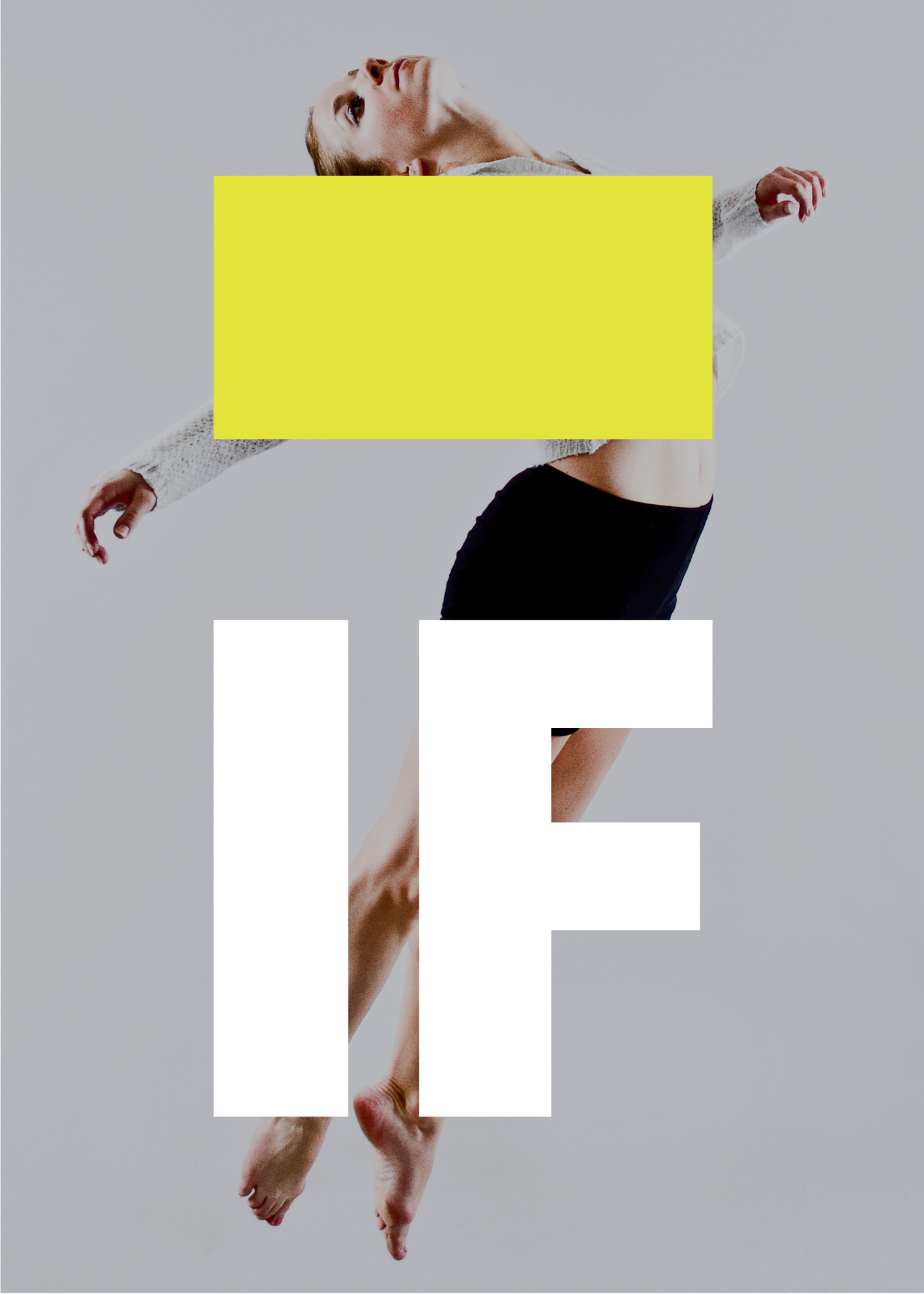
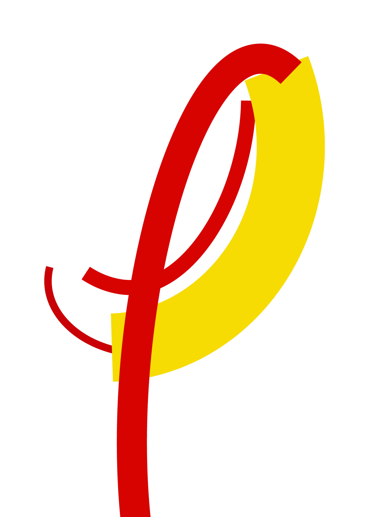
isolated two first letters of festival acronym to give it a new meaning
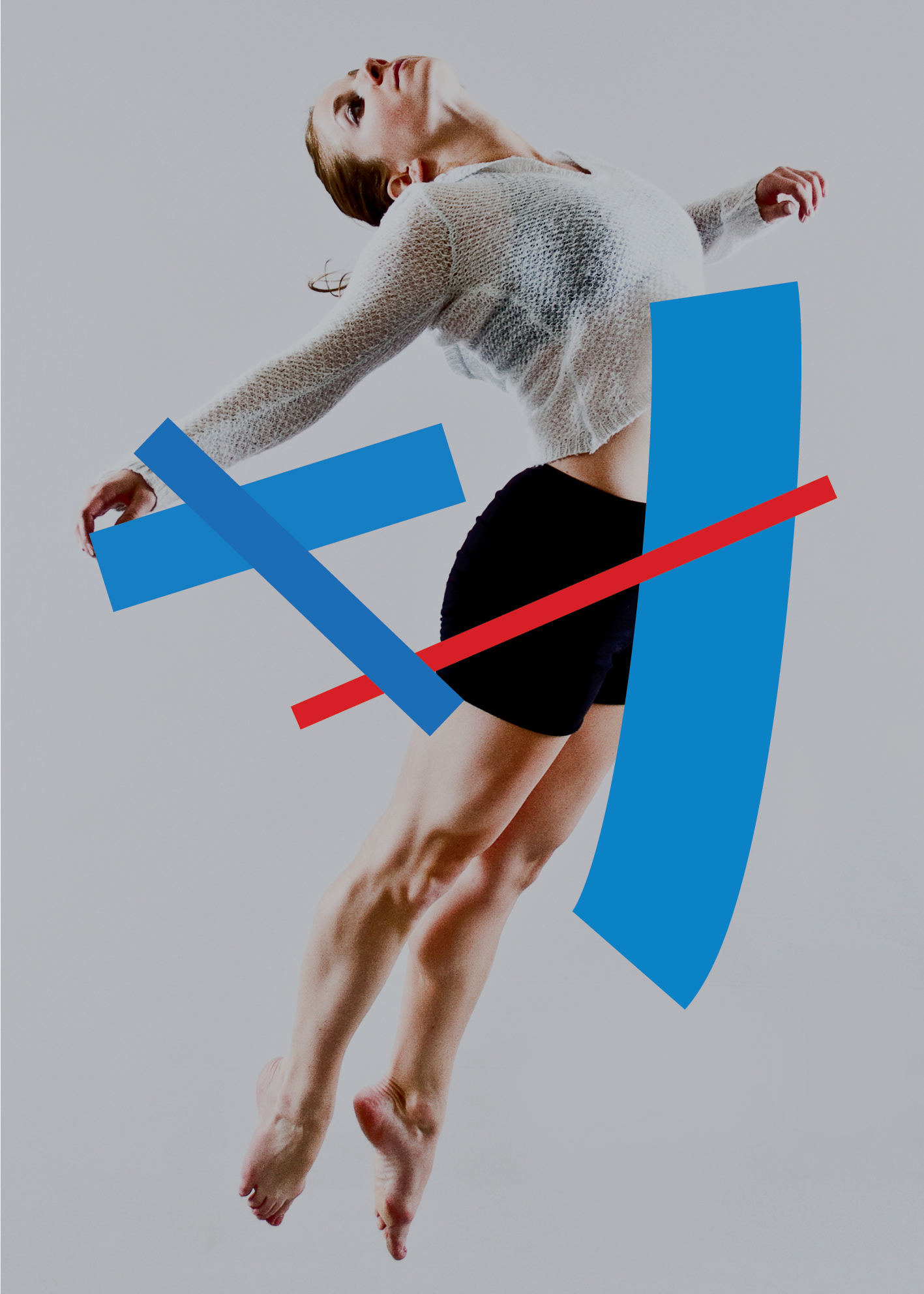
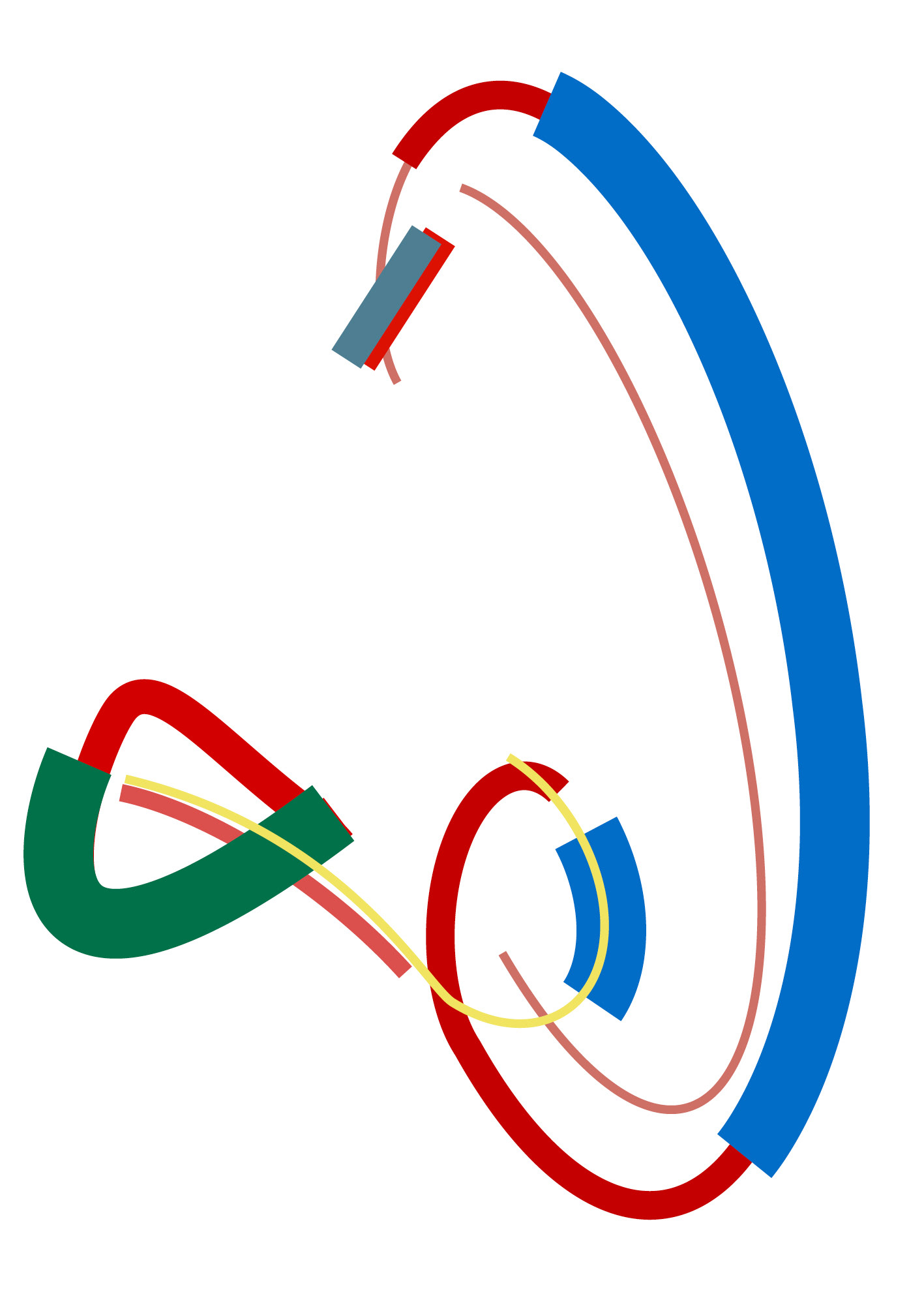
i've always liked the vector based logo done for this festival years ago by a talented colleague. so i tore it apart and blew it up (mad scientist laughter here)

i would just love to do some motion graphics with this
took elements from the existing logo and blew them way out of proportion. i just love vector graphics
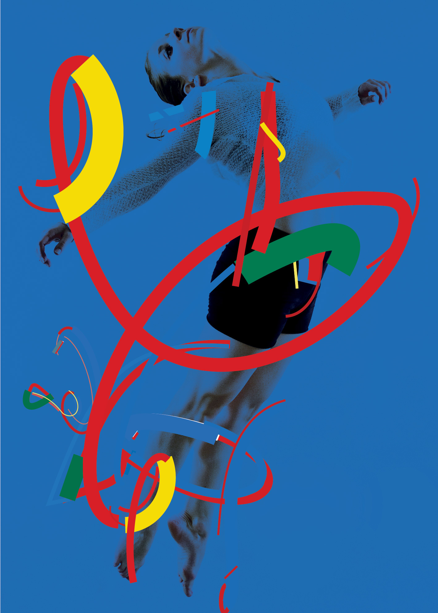
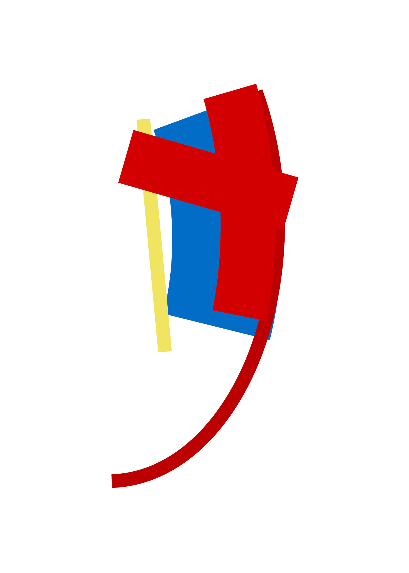
deconstructed logo elements to accentuate image. too much?
one more try